| Author |
 Replies: 23 / Views: 2,491 Replies: 23 / Views: 2,491 |
|
Valued Member
United States
178 Posts |
I posted a new photo, post 16 at the top of page 2. I'd actually like opinions on the new photo and the MS65 grade. This is a 1900 P Barber dime graded MS65. I took the photos at our coin shop using the overhead fluorescent lighting, which resulted in some glare. (I usually photograph silver coins at home using incandescent lighting, but I'm not asking about lighting.) In the 1914 D Lincoln Cent thread, a forum member couldn't make out the 4 until he enlarged the pic, but that coin was only graded G. However, it makes me wonder whether or not people want really large photographs when viewing a coin. Would you want to see the smaller photograph of this Barber dime or would you want to see the really large one? And is the glare a problem? 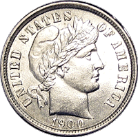 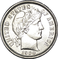   Edited by TonysPics
06/04/2009 6:07 pm
|
|
|
|
Pillar of the Community
United States
2525 Posts |
For grading and attribution purposes I would prefer the larger pic! (my eyes aren't what they used to be)
|
|
Pillar of the Community
United States
608 Posts |
The larger is always better for grading. Glade is a problem because it may hide something.
|
|
Pillar of the Community
United States
528 Posts |
I like the first of the two larger photos.
|
|
Moderator
 United States
23731 Posts |
The first of the two large photos are the best for grading.
|
|
Bedrock of the Community
United States
12437 Posts |
Larger is always better but glare can render a coin ungradable by photo.
|
|
Valued Member
United States
195 Posts |
I think photo #3 (the first large one) would be the best for grading. Photo #4 has too much glare, which makes it harder to see the details of the coin.
|
|
Pillar of the Community
United States
1415 Posts |
WHOA! I don't think you can take a bad picture of this coin!
|
|
Pillar of the Community
United States
1291 Posts |
I would like to see the coin photographed in COLOR, rather than black and white. Not trying to be "Danny Downer" or anything, but if that coin is MS-65, between the glare and the fact that you shot it in black and white, I think you did it a disservice - regardless of size. Here's a great thread by one of our members regarding digital coin photography: https://goccf.com/t/29441Edited by weerdsteev
05/30/2009 09:53 am
|
|
Moderator
United States
23522 Posts |
Quote:
Here's a great thread by one of our members regarding digital coin photography: Thank you for the kind words. Your check's in the mail.  TonysPics, the larger photos here are about the correct size for grading and evaluation purposes. You generally want a coin size of no less than 500 pixels, preferably larger, for a clear evaluation. You've obviously got a camera that's up to the task, so all that's needed now is some tweaking of lighting and camera settings. Using the pics here as an example, the lighting is a bit too concentrated, so there's always going to be a little bit washed out at 3:00 on the coin when you use this particular light. You'll be striking a balance between washing out as little as possible at 3:00, and keeping the exposure long enough to still show the details at 9:00 on the coin. If the exposure for these pics was (and I'm pulling a number out of my head), say, 1/80, the exact same setup with an exposure of 1/125 or 1/160 will probably be a better compromise between the two sides. I don't want to get too deep into it here, because we've got a dedicated forum for this stuff and the thread wheezydogweerdsteev was so nice to link covers much of it. I will say, however, that I think you're only a little tweaking away from that dime looking like this one:   |
|
Pillar of the Community
United States
1291 Posts |
SuperDave: Whoa! Whoa! Whoa! Get your Forum members straight! Especially if you're sending checks in the mail! DO NOT SEND THE CHECK TO WHEEZYDOG!!!
|
|
Moderator
United States
23522 Posts |
Oops.  Appropriate edits made. |
|
Valued Member
 United States
178 Posts |
The photos might come out better when I take them at home with incandescent lighting.
|
|
Pillar of the Community
United States
1291 Posts |
SuperDave - I have no Barber dime expertise so maybe the answer to this question is obvious to some but not me... What is going on with the obverse of that 1892 you posted? Especially in the field just to the right of and under the chin? It almost looks a "negative" of the wreath from the reverse...? Is it just a reflection, a lamination error, product of my overactive imagination...? Also looks like some doubling beneath the first three characters of the date. |
|
Bedrock of the Community
United States
12437 Posts |
That Barber has heavy and probably multiple clash marks. The apparent doubling of the date is a shadowing effect due to toning or lack thereof in the shadow of the date. This phenomenon is most apparent on toned Morgans and is a good indicator of natural toning since it is an effect that can only be imparted through slow, long term toning.
|
|
Moderator
United States
23522 Posts |
 What he said. That Barber was among the most heavily-clashed coins I'd ever seen. That said, my choice of lighting for the shot involved deliberately emphasizing the clashing, so it was even more prominent in the photos than it was in-hand. Quite the cool little coin, that was. |
| |
Replies: 23 / Views: 2,491 |


