| Author |
 Replies: 17 / Views: 3,920 Replies: 17 / Views: 3,920 |
|
Press Manager
 United States
1420 Posts |
CoinWorld - The approved reverse design for the 2017 Native American dollar was released Dec. 1 by the U.S. Mint.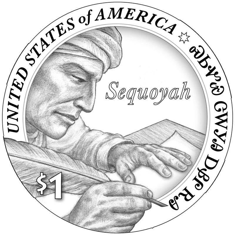 The design will appear on all versions and finishes of the Native American dollar issued in 2017, including Proof, Uncirculated, and circulation-quality versions. The 2017 reverse design features a profiled likeness of Cherokee silversmith Sequoyah writing "Sequoyah from Cherokee Nation" in the syllabary he created, along the design's border. Inscriptions SEQUOYAH, UNITED STATES OF AMERICA, and $1 are written in English in the field of the design. The adopted reverse was executed by U.S. Mint Artistic Infusion Program artist Chris Costello and sculptured by then U.S. Mint Sculptor-Engraver Charles L. Vickers, now retired. The adopted reverse will be paired with the obverse portrait of Sacagawea and her infant son, Jean-Baptiste, executed by sculptor Glenna Goodacre for the Sacagawea dollar issued from 2000 to 2008, and continued on the Native American dollar series beginning in 2009. The obverse inscriptions are LIBERTY and IN GOD WE TRUST. The edge will feature, incuse, the date, Mint mark and motto E PLURIBUS UNUM.
|
|
|
|
Bedrock of the Community
United States
11951 Posts |
Maybe this will better in hand ... but from seeing this I am not impressed.
I really like the Sac/Native American dollars.
I look at this design .. it does not look Native American to me.
|
|
Pillar of the Community
United States
4870 Posts |
The design isn't bad but I'm passing on this. I'd rather see the date/mm on the obverse and I want to see ONE DOLLAR instead of the cheesy $1.
|
|
Moderator
United States
14463 Posts |
I will get one with my normal subscription, and may keep a lookout for another maybe in a special holder. I am part Cherokee.  |
|
Rest in Peace
United States
17900 Posts |
I really don't like it, I'm afraid to say.
|
|
Pillar of the Community
 United States
4610 Posts |
IMNSHO it's another design that will look better in the artist's rendering than on the struck coin.
-----Burton 50+ year / Life / Emeritus ANA member (joined 12/1/1973) Life member: Numismatics International, CONECA Member: TNA, FtWCC, NETCC, EveryCountry (online) coin club Owned by three cats and a wife of 40+ years (joined 1983) Author: 3rd Edition of the Sample Slabs book, https://www.sampleslabs.info/ |
|
Pillar of the Community
United States
5216 Posts |
Quote:
Proof, Uncirculated, and circulation-quality versions I assume since these are NIFC that by "Uncirculated" they are referring to those struck / chosen for mints sets and "Circulation Quality" are for bags and rolls. Unless they are planning to dump them into circulation again. |
|
Pillar of the Community
United States
4211 Posts |
So far I have liked all the reverses.
I will have a better idea once I actually see it in person.
|
|
Bedrock of the Community
United States
10051 Posts |
To me this one looks a lot more in step with the Indian theme than the 2015 "man on a skyscraper."
I also like the native language/lettering "being written" on it.
However, these modern design really are incredibly lacking compared to what our coinage used to be when people like Gasparro, Weinman, Saint Gaudens, etc. had their hand in it.
How much squash could a Sasquatch squash if a Sasquatch would squash squash? Download and read: Grading the graders Costly TPG ineptitude and No FG Kennedy halveshttps://ln5.sync.com/dl/7ca91bdd0/w...i3b-rbj9fir2 |
|
Pillar of the Community
United States
1361 Posts |
I like it, just wish there was some writing on the paper. Sequoyah looks a little uninspired as it is.
And remember guys and gals, just because a coin series celebrates Native Americans doesn't mean each coin has to 'look Native'. Native American culture has many different aspects and looks, and it continues evolving even to this day.
Edit: I wonder how high the relief on this coin will have to be. There's several layers to it... Hand over pen over rim over face.
Edited by coinsearcher83
12/03/2016 09:50 am
|
|
Pillar of the Community
United States
1346 Posts |
Ugh. Looks like student work.
|
|
Bedrock of the Community
United States
12877 Posts |
I like the concept but not the actual design presented.
|
|
Pillar of the Community
United States
3516 Posts |
Looks pretty cool, but not to be on a coin. I hope we are all wrong
|
|
Moderator
United States
191235 Posts |
Quote:
I assume since these are NIFC that by "Uncirculated" they are referring to those struck / chosen for mints sets and "Circulation Quality" are for bags and rolls. Like the half dollars, bags and rolls have always been circulation quality. Only the mint sets get the uncirculated version. |
|
Bedrock of the Community
United States
17884 Posts |
Quote:
And remember guys and gals, just because a coin series celebrates Native Americans doesn't mean each coin has to 'look Native'. Correct, hence the "man on a skyscraper" design. It was done because back in the early 20th century a very large percentage of the people who worked the "high iron" building skyscrapers were of Mohawk decent. Not sure why but they seem to be better able to adapt to the heights and walking around on the steel beams. The one thing I noticed is that it almost looks like he is wearing a turban. I hope the designer wasn't thinking of a different type of "Indian". |
|
Moderator
United States
191235 Posts |
Quote:
The one thing I noticed is that it almost looks like he is wearing a turban. I hope the designer wasn't thinking of a different type of "Indian". I think that is appropriate. However, if there was confusion, then it predates this design, as seen in the photo in the Wikipedia article... https://en.wikipedia.org/wiki/Sequoyah |
| |
Replies: 17 / Views: 3,920 |


